Visualize Your Data: Charts in Google Apps Script!
September 7, 2011
Charts are a great way to communicate significant amounts of data. We’ve joined forces with the Google Chart Tools team in order to bring a new Charts API to Apps Script. Every day, millions of charts are created, updated, put into presentations, emailed to managers, and published as web pages. Our goal is to automate chart creation in Google Apps and make the sometimes-tedious tasks of chart creation and updating a little more fun!
In the example above, we’ve hard-coded the data. You can also populate the table in any of these ways:
In the above chart, the only required methods are
Charts can also be used as Blobs. This allows Charts to be attached to Sites pages, saved to your Docs List, or attached to outgoing emails. The code below does all three of these things:
And that’s it. We hope you enjoy the new API. If your favorite chart is not here yet, or if you have ideas on how we could improve the API, please let us know in our forum. Finally, enjoy the income chart we’ve been building.

Want to weigh in on this topic? Discuss on Buzz
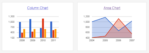
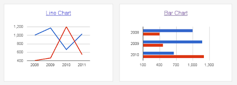
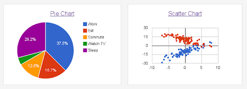
Charts Ahoy!
Our initial launch includes six chart types. These can be attached to sites, sent as email attachments, or displayed using an Apps Script UiApp.4 Easy Steps to Create Charts
Step 1 - Open Apps Script Editor
You can access the Apps Script Editor from a Spreadsheet or a Google Sites Page. To access the Apps Script Editor from a Spreadsheet, Open a New Spreadsheet > Tools > Script Editor. To open the Script Editor from a Google Sites, More > Manage Site > Apps Scripts > Add New Script.Step 2 - Create a Data Table
To build a chart, the first thing you need is a data table. The data table contains the data for the chart as well as labels for each category. In general, data tables contain one column of labels followed by one or more columns of data series, with some variations. Read the documentation for the type of chart you’re creating to learn the exact data table format it expects. Here’s an example of how you’d create a data table in Apps Script to use with a column chart:function doGet() {
// Populate the DataTable. We'll have the data labels in
// the first column, "Quarter", and then add two data columns,
// for "Income" and "Expenses"
var dataTable = Charts.newDataTable()
.addColumn(Charts.ColumnType.STRING, "Quarter")
.addColumn(Charts.ColumnType.NUMBER, "Income")
.addColumn(Charts.ColumnType.NUMBER, "Expenses")
.addRow(["Q1", 50, 60])
.addRow(["Q2", 60, 55])
.addRow(["Q3", 70, 60])
.addRow(["Q4", 100, 50])
.build();
In the example above, we’ve hard-coded the data. You can also populate the table in any of these ways:
- Fetch the data from an existing spreadsheet using
SpreadsheetApp - With data from a
UiAppform - Using our JDBC API
- Using
UrlFetch - Or any other way in which you can get an array of data using Apps Script.
Step 3 - Build a Chart using Data Table
Once you have the data table ready, you can start building the chart. Our top-level Charts class has Builders for each of the chart types we support. Each builder is configured for the specific chart you’re building, exposing only methods which are available for the specific chart type. For example, in a Line Chart you can make the angles smooth, in Bar and Column Charts you can stack up the data, and in Pie Charts you can make the whole chart 3D!Here’s an example of using the above data table to build a Column Chart:// Build the chart. We'll make income green and expenses red
// for good presentation.
var chart = Charts.newColumnChart()
.setDataTable(dataTable)
.setColors(["green", "red"])
.setDimensions(600, 400)
.setXAxisTitle("Quarters")
.setYAxisTitle("$")
.setTitle("Income and Expenses per Quarter")
.build();
In the above chart, the only required methods are
setDataTable() and build(), all of the others are optional. If you don’t set colors and dimensions, for instance, we’ll pick some default values for you. Use the different setter methods to customize your chart, however and whenever you feel like it.Step 4 - Publish your chart in Documents, Email, Sites or UiApp
Once you’ve built your chart, there are different things you can do with it. For example, you can add it to an Apps Script UI. You can add a chart to any part of the UI that takes a widget, including the application itself. The following code snippet shows you how to publish a chart withUiApp.// Add our chart to the UI and return it so that we can publish // this UI as a service and access it via a URL. var ui = UiApp.createApplication(); ui.add(chart); return ui;}
Charts can also be used as Blobs. This allows Charts to be attached to Sites pages, saved to your Docs List, or attached to outgoing emails. The code below does all three of these things:
// Save the chart to our Document List
var file = DocsList.createFile(chart);
file.rename("Income Chart");
file.addToFolder(DocsList.getFolder("Charts"));

// Attach the chart to the active sites page.
var page = SitesApp.getActivePage();
page.addHostedAttachment(chart, "Income Chart");

 // Attach the chart to an email.
MailApp.sendEmail(
    "recipient@example.com",
    "Income Chart",  // Subject
    "Here's the latest income chart", // Content
    {attachments: chart });
And that’s it. We hope you enjoy the new API. If your favorite chart is not here yet, or if you have ideas on how we could improve the API, please let us know in our forum. Finally, enjoy the income chart we’ve been building.
| Gustavo Moura Gustavo has been a Software Engineer at Google since 2007. He has been part of the Google Docs team since 2009. Prior to that, he worked on AdWords. |
Want to weigh in on this topic? Discuss on Buzz